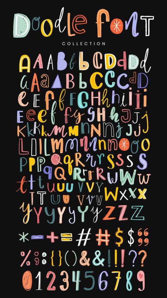

In the world of design, fonts are like the spices in a chef’s kitchen—they can make or break the dish. Choosing the right font sets the tone, communicates the message, and ultimately determines how your design is perceived. However, with thousands of fonts available at our fingertips, it’s easy to get carried away. In this blog post, we’ll explore some tips for using fonts wisely to enhance your designs without overwhelming them.
1. Less is More
When it comes to fonts, less is often more. Limit yourself to two or three fonts per design to maintain consistency and coherence. Selecting a primary font for headings and a secondary font for body text is a good starting point. If necessary, you can introduce a third font for accents or emphasis, but use it sparingly to avoid visual clutter.
2. Prioritize Readability
No matter how stylish a font may be, readability should always be your top priority. Ensure that the chosen fonts are easy to read, especially for longer passages of text. Steer clear of overly decorative or intricate fonts that sacrifice legibility for style. Remember, if your audience struggles to read your message, your design loses its effectiveness.
3. Establish Hierarchy
Utilize variations in font size, weight, and style to create a clear hierarchy of information within your design. Headlines should be larger and bolder than body text, while subheadings can be slightly smaller but still distinguishable. Experiment with different combinations until you find a hierarchy that guides the reader’s eye through the content seamlessly.
4. Contrast with Care
Contrast can add visual interest to your design, but use it judiciously. When pairing fonts, aim for contrast without sacrificing harmony. Combining a serif font with a sans-serif font, or a bold font with a light font, can create a pleasing contrast that highlights important information. However, avoid pairing fonts that clash or compete for attention.
5. Stick to Brand Guidelines
If you’re designing for a specific brand or organization, adhere to their established brand guidelines. Choose fonts that align with the brand’s personality, values, and target audience. Consistency in font choice reinforces brand identity and fosters brand recognition across various touchpoints.
6. Test Across Platforms
Before finalizing your design, test it across different platforms and devices to ensure compatibility and readability. Fonts may appear differently on various screens and operating systems, so it’s essential to preview your design in different environments. Pay attention to how the fonts render and make adjustments as needed.
7. Embrace White Space
Don’t underestimate the power of white space in font selection. Adequate spacing between letters, lines, and paragraphs enhances readability and gives your design room to breathe. Resist the temptation to cram too much text into a limited space. Embrace white space as a design element that enhances clarity and elegance.
Conclusion
Fonts play a vital role in design, but they should enhance your message rather than overshadow it. By following these tips and taking a less-is-more approach, you can use fonts effectively to create visually stunning and highly readable designs. So take it easy with the fonts, and let your message shine through!