When it comes to designing and printing, there are two color modes that are commonly used – RGB and CMYK. Understanding the differences between these two color modes is crucial for creating high-quality designs that look great both on screen and in print.
RGB (Red, Green, Blue) is an additive color mode that is used primarily for electronic displays such as computer monitors, televisions, and mobile devices. In this color mode, colors are created by adding different amounts of red, green, and blue light. When all three colors are combined at full strength, they create white. This is why you may have seen RGB color codes represented as three numbers between 0 and 255, representing the intensity of each color channel.

RGB images can be rich, vibrant and beautiful on-screen.
CMYK (Cyan, Magenta, Yellow, Key or Black) is a subtractive color mode that is used primarily for printing. In this color mode, colors are created by subtracting different amounts of cyan, magenta, yellow, and black ink from a white paper base. When all four inks are combined at full strength, they create black. The “K” in CMYK stands for “key,” which refers to the black ink channel, as black is the key color in printing.

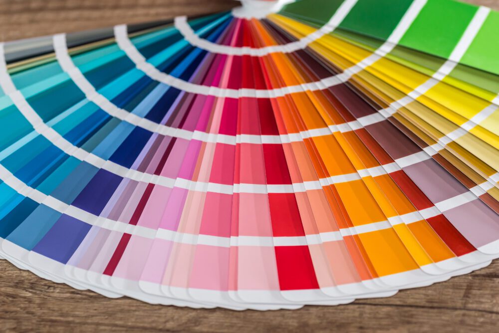
In print, all colors are made from mixing these four ink colors together.
One key difference between RGB and CMYK is their color gamut, which refers to the range of colors that can be displayed in each mode. RGB has a wider gamut than CMYK, meaning that it can display a greater range of colors. This is why it looks so bright and vibrant on screen and then dull and a little weaker in print – this is because RGB uses light to create colors, while CMYK uses ink, which can be absorbed or reflected by the paper base.
Another difference between the two color modes is their suitability for different types of media. RGB is best for electronic displays such as websites and social media graphics, while CMYK is best for printed materials such as brochures, business cards, and posters. If you design something in RGB and then print it in CMYK, the colors may look different than what you intended. This is why it is important to convert your designs to the appropriate color mode before sending them to a printer. A good graphic designer will know to do this. Especially difficult are the greens, blues, and purples. They have bigger shifts from on-screen to paper.
In summary, understanding the differences between RGB and CMYK is crucial for creating high-quality designs that look great both on screen and in print. RGB is best for electronic displays and has a wider color gamut, while CMYK is best for printing and has a more limited color gamut. Make sure to convert your designs to the appropriate color mode before sending them to a printer to ensure that your colors come out looking the way you intended.


